Paradigm Shifts at the ICP
 Robert Capa in color? That’s a bit like Philip Glass going hip hop, isn’t it, or Thomas Pynchon writing a TV pilot? The most famous war photographer of the twentieth century is so famed for his black-and-white work that it comes as something of a shock to see a whole exhibition of color work by Capa. At first, it almost looks as if
some clever provocateur with Photoshop has taken a digital brush
to his monochrome work–making sure to select a saturated 1950s palette.
Robert Capa in color? That’s a bit like Philip Glass going hip hop, isn’t it, or Thomas Pynchon writing a TV pilot? The most famous war photographer of the twentieth century is so famed for his black-and-white work that it comes as something of a shock to see a whole exhibition of color work by Capa. At first, it almost looks as if
some clever provocateur with Photoshop has taken a digital brush
to his monochrome work–making sure to select a saturated 1950s palette.
But in fact, there’s no trickery. The International Center of Photography ‘s new show Capa in Color is exactly what its title implies: a survey of Capa’s work in color. Work he began in 1938, soon after the launch of Kodachrome (the first color roll film), and continued until his death in 1954.
Why now? The ICP has been sitting on a cache of Capa color slide positives, and the fact they haven’t seen the light of day until now begs a couple of obvious questions. For example: Has the work perhaps been suppressed because it’s no good? Or: Even if good, was it deemed inferior to his black-and-white work and likely to sully the legend of the great and serious Capa?
The answers to those questions are, respectively: not really, and, maybe a little. Capa’s color work is patchy, for several reasons, including the slow speed of color film (the first Kodachrome was 10 ASA), his own difficulty mastering some technical aspects, and the fact that he was given some uninspiring assignments by editors. But there’s enough very good work here—like his brief documentation of a family circus in Indiana—to show that he saw well in color.

The “sullying of a legend” possibility is more persuasive. Some of Capa’s color subjects are pretty lightweight—pictures of ski resorts and movie sets—and as curator Cynthia Young writes in the exhibition catalog, by the 1960s, “[Robert] Capa was a standard bearer of Cornell Capa’s concept of a concerned photographer, embodying truth, commitment and engagement. His color subjects had no place in that vision.”
Above all, though, the delay in making Capa’s color work public rested on a technological issue. Early Kodachrome and Ektachrome films were not built to last, and the colors of many positives had faded dramatically. The degradation was rapid enough that even when Cornell Capa organized his brother’s archives in the 1950s, he wrote on some envelopes, “bad color,” “documentary value only,” or “souvenir value only.” It wasn’t until the advent of digital photography that the positives could be scanned, color corrected and accurately printed.
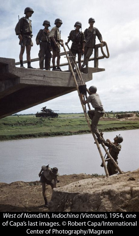 Looking at this body of work now, some interesting facts emerge. One is that Capa was ahead of his time. His first color shots, of the Chinese town of Hankow in flames after a 1938 attack in the Sino-Japanese War, show a shrewd use of color: that fire simply wouldn’t have popped in black and white. Capa saw this was the way news photography was going: the exhibition includes a 1952 stockholders’ report he wrote for the Magnum Agency, in which he urges his colleagues to respond to the “very definite development toward color” in news magazines.
Another fact is that Capa—confident and arrogant as he was—was often hamstrung by the limited vision of magazine editors wanting banal stories. The show includes a 1948 letter from Magnum’s Maria Eisner to Capa, in which she remarks, “We have to face the fact that in general our stories are too big, too serious, and even too good.” Capa did get to do some big geopolitical stories—going with Irwin Shaw to record the foundation of Israel, and with John Steinbeck to capture life in the U.S.S.R.—but postwar America was hungry for fluff. That was frustrating. In 1953, after several years spent in ritzy beach resorts and on movie sets, Capa expressed his desire “to get back to real work, and soon. What and where I do not know, but the Deauville and Biarritz and motley movie period is over.”
 One more fact (though this won’t be news to anyone who’s read Capa’s memoir
Slightly Out of Focus
) is that Capa was a good writer. Included in the exhibit are many examples of articles he wrote—in fact, it was because of his skill as a magazine writer that Henry Holt & Company first published
Slightly Out of Focus
. In one of my favorite quotes here, he brings a military metaphor to describe Parisians’ summer beach society, and how “all the lovely girls who have fought their way to the top of Paris champagne society are preparing for the Battle of Deauville.”
One more fact (though this won’t be news to anyone who’s read Capa’s memoir
Slightly Out of Focus
) is that Capa was a good writer. Included in the exhibit are many examples of articles he wrote—in fact, it was because of his skill as a magazine writer that Henry Holt & Company first published
Slightly Out of Focus
. In one of my favorite quotes here, he brings a military metaphor to describe Parisians’ summer beach society, and how “all the lovely girls who have fought their way to the top of Paris champagne society are preparing for the Battle of Deauville.”
Of course, Capa himself was a colorful character. He was a gambler, chameleon, and seducer of beautiful women —so it’s only natural he would have been drawn to color as a mode of self-expression. What Capa in Color shows is that, although he was feeling his way in a new paradigm and made a few fumbles, he had the eye and the skill to make the transition to color. There is even justification, perhaps, for his typically grandiose claim to Cornell in a 1941 letter about color shots of the Royal Air Force, that the project “is badly developed—but I am a great photographer!”
 Speaking of paradigm shifts, the downstairs show at ICP accompanying
Capa in Color
is a provocative little number called
What is a Photograph?
This turns out to be less philosophical than it could be in the age of digital manipulation. The show, curated by Carol Squiers, is basically a survey of people working at the meeting point between photography and conceptual art. It could be subtitled, “Artists doing arbitrary and occasionally interesting things at the borders of photography.”
Speaking of paradigm shifts, the downstairs show at ICP accompanying
Capa in Color
is a provocative little number called
What is a Photograph?
This turns out to be less philosophical than it could be in the age of digital manipulation. The show, curated by Carol Squiers, is basically a survey of people working at the meeting point between photography and conceptual art. It could be subtitled, “Artists doing arbitrary and occasionally interesting things at the borders of photography.”
It doesn’t take too much brainpower to imagine what this means. Combining found photographs with objects, from concrete blocks to fluorescent light tubes? Check. Creating hybrids of video and still photography? Check. Making camera-less prints that involve light-painting on photo paper, partially soaking it with chemicals, or scratching into it with heat guns and X-ACTO knives? Check, check and check. There’s pretty much any kind of mash-up you can imagine, really, which is fitting enough in this age of porous genre borders.

Some of the work is edgy, some of it beautiful. I especially liked Alison Rossiter ‘s delicate abstracts made by dipping expired photo paper into chemicals, and Mariah Robertson’s 100-foot-long hanging scroll of color imagery printed on metallic photo paper. In this setting I even liked some of current art world darling Marco Breuer ‘s scored and melted-emulsion images, which I hadn’t liked on a recent visit to the Yossi Milo Gallery .
And I don’t have anything against conceptual work—really! Here’s a review I wrote of a conceptual show that I loved . It’s just all the posturing around it that I hate. For example, Breuer doesn’t mark and scratch photo paper, but “stages direct engagements” with it; Robertson’s scroll achieves “a jittery, slightly apocalyptic aura” and a “precarious stasis of energy unleashed.” Oh Artspeak, who will dare to renounce thy dry and obfuscating language! Where is the contemporary artist who, like the little boy in The Emperor’s New Clothes , will stand up and say, “I just thought it might be cool to attack a piece of paper with a knife”?
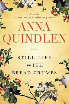 This brings me to a novel I just read,
Anna Quindlen
‘s new book
Still Life with Bread Crumbs
. It tells the story of Rebecca Winter, a sixty-something photographer who accidentally achieved fame in her thirties with a series of images of dirty kitchen countertops. They turned out to be the right pictures at the right time: Second Wave Feminism was in full flow, Rebecca was hailed as a champion of personal-is-political art, and her image
Still Life with Breadcrumbs
became a staple of college dorm rooms. One of the funniest passages involves Rebecca’s reaction to the way her work is perceived:
This brings me to a novel I just read,
Anna Quindlen
‘s new book
Still Life with Bread Crumbs
. It tells the story of Rebecca Winter, a sixty-something photographer who accidentally achieved fame in her thirties with a series of images of dirty kitchen countertops. They turned out to be the right pictures at the right time: Second Wave Feminism was in full flow, Rebecca was hailed as a champion of personal-is-political art, and her image
Still Life with Breadcrumbs
became a staple of college dorm rooms. One of the funniest passages involves Rebecca’s reaction to the way her work is perceived:
“Once Rebecca had read an essay in which a feminist theorist posited that the word still was obviously a way of suggesting how empty the existence of the average American woman was, that the bread crumbs were an allusion to Hansel and Gretel, leaving a trail so someone could find you, rescue you, keep you from being eaten alive. Rebecca had been amazed at how much could be divined from a photograph she had snapped unthinkingly in a haze of fatigue overlaid with unacknowledged anger, and a title she had come up with haphazardly when the gallery had decided that simply numbering the photographs wouldn’t do.”
Ok, it’s an easy target—but former New York Times Public and Private columnist Quindlen (who knows a thing or two about being a feminist icon) nails it, I think.
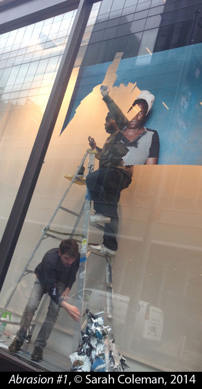 Coincidentally, when I was leaving the ICP there were workers removing a series of
Gideon Mendel
‘s portraits of flood victims,
Drowning World
,
from the large museum windows. I stopped to watch: the photographs on the windows were in an interesting stage of semi-disappearance, bits of faces and houses hanging on while other scraps of the same images lay curled on the floor. I couldn’t resist documenting the scene, though I only had my iPhone: the peeling-away of layers (and the cultural significance of an African-American removing a portrait of a “drowning” African man) seemed at least as interesting as what was going on downstairs in the museum. Maybe, just maybe, if I described them as “images that meditate on time and transiency through the abrasion and removal of previously whole photographs,” I could sell these “depictions of old-fashioned labor memorialized with the spontaneity of digital capture.” What do you think?
Coincidentally, when I was leaving the ICP there were workers removing a series of
Gideon Mendel
‘s portraits of flood victims,
Drowning World
,
from the large museum windows. I stopped to watch: the photographs on the windows were in an interesting stage of semi-disappearance, bits of faces and houses hanging on while other scraps of the same images lay curled on the floor. I couldn’t resist documenting the scene, though I only had my iPhone: the peeling-away of layers (and the cultural significance of an African-American removing a portrait of a “drowning” African man) seemed at least as interesting as what was going on downstairs in the museum. Maybe, just maybe, if I described them as “images that meditate on time and transiency through the abrasion and removal of previously whole photographs,” I could sell these “depictions of old-fashioned labor memorialized with the spontaneity of digital capture.” What do you think?
————————————————–
Capa in Color and What is a Photograph? are on view at the International Center of Photography through May 4, 2014. For hours and directions, click here .
4 comments on “ Paradigm Shifts at the ICP ”
Leave a Reply
Connecting to %s


Hi, Sarah – I hope you are surviving the winter from hell. I write for two reasons: The Capa piece was fascinating, and as usual your take was an original one. One quibble, however, Kodachrome and Extachrome were slide films, not negative films. There would have been slides, not negatives, no?
Second. Last month I spent two weeks in Liberia, teaching and shooting for two literacy focused NGOs. You will find black and whites taken in Liberian schools here:
http://www.bdcolenphoto.com/Journalism/LIBERIAN-SCHOOLS-IN-BLACK-AND/36333705_n3DdJ5#!i=3042963688&k=BnvQNBP
And some general color work here:
http://www.bdcolenphoto.com/Journalism/A-View-of-Liberia-2014/36559884_Zj9QsW#!i=3043319199&k=hRdXRrp
There is also a third open gallery of color under photo journalism on my website.
I wonder if the work, particularly the black and white, and questions that can be raised about it might be appropriate for the Literate Lens.
Best,
B. D.
B. D. Colen http://www.bdcolenphoto.com bdcolen.tumblr.com bd@bdcolenphoto.com 617-413-1224
>
B.D. — you are so right about Kodachrome and Ektachrome! Thanks for pointing that out. Will fix. And thanks for the update. I look forward to browsing your recent work, and will get back to you.
Well done, Sarah. I wish I could get over to see Capa in Color.
Meanwhile I eagerly await “images that meditate on time and transiency through the abrasion and removal of previously whole photographs”!
Michael: Come before May 4th and you can catch it!