Colorizing History: An Interview with Sanna Dullaway
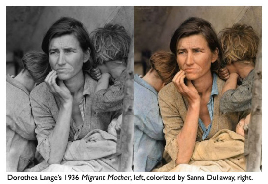 This week, Sanna Dullaway’s colorized versions of famous historic photographs went viral on the Internet, drawing both admiration and alarm. Dullaway had picked some truly iconic photographs to colorize, from Dorothea Lange’s
Migrant Mother
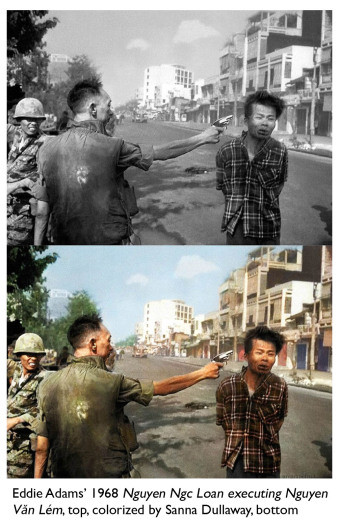
to Eddie Adams’ famous shot of a Vietnamese general executing a Vietcong prisoner during the opening stages of the Tet Offensive. The young Swede (who has just launched a business colorizing old family snapshots) displayed these color versions side-by-side with the originals. Suddenly, figures and scenes long burned into our minds in their original black-and-white incarnations were popping out in glorious color–rusty reds, rich golds, the blue of cornflowers and irises. The images spread quickly on news sites and Facebook feeds—and then some people got mad.
 “A parasitical one trick pony grazing on the shoulders of giants,” Dullaway was called in one Facebook photography thread, while someone else excoriated her for “coloring that like a coloring book.” “Sickening” and “inexcusable” were other adjectives thrown out. Some were more generous, admiring Dullaway’s technique and color choices, and writing that it had given them a new appreciation of the original work.
I was intrigued by this response, and by the protectiveness people felt toward these images. Personally I found them fascinating, and not confusing or deceptive since they were printed side-by-side with the original black-and-whites. (In that way it’s not like watching a colorized movie on TCM, where you have no reference to the original.) Granted, I’ve seen the colorized versions put up on web sites on their own this week, but that wasn’t Dullaway’s intent.
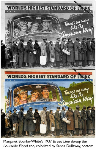
Once you understand this as an exercise, I think it’s fascinating to see how we respond to the colorized images. The best ones come alive, dissolving the distance between past and present. You notice different things: the clear blue sky in the Adams image, dirt on the kids’ necks in the Lange image. You’re engaging with the photograph in a new, interesting way.
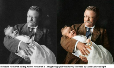
Colorized photographs are nothing new. People have even put colorized versions of iconic photographs online before, as in this version of the famous Lange image. What was new here was the sheer volume and range of Dullaway’s work, her cheerful appropriation of everything photographic. Included were not just portraits of long-dead presidents and celebrities, or powerful images from the Great Depression, but also shots from the Vietnam War—an event recent enough that the photographers could have chosen to shoot color images themselves.
 In all the noise this week, one thing that wasn’t being heard was
Dullaway’s voice. I was intrigued to see what her intent was in colorizing these images, and how she felt about the reactions, so I contacted her over email. She was cheerful and responsive, eager to set the record straight as she spoke about the media attention, the criticism and the act of colorizing history.
LL: You’re a very good colorist. How did you learn your skills?
SD: The technique is available for everyone: Color Mode in Photoshop. My sense of color and lighting is self-taught, I’ve never taken any art classes. I’ve been a hobby photographer for years and I think that’s where I “learned” how colors work in photographs. For example grass is not only green, it is lit up in the yellow warm sunlight and toned down in the shadows’ blue tones.
LL: When did you first get the idea to colorize famous historic photographs, and what was your intention in doing so?
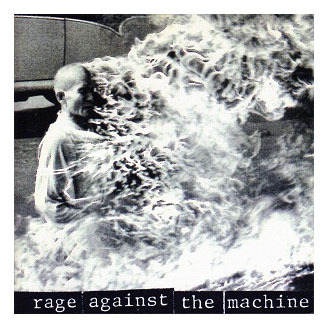 SD: I was listening to
Rage Against The Machine
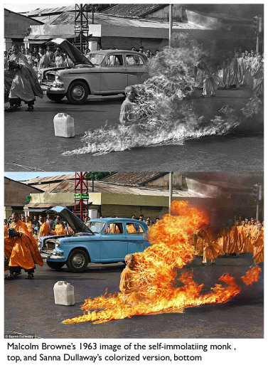
and I saw the album art of the burning monk [a close-up of Malcolm Browne’s iconic 1968 image]. I was impressed by the photo but I thought it would be more impressive if the fire was the color of fire, because it looks really dull in black and white. I’m pretty decent with Photoshop and by accident I found that Color Mode did magic to the photo and colorized the fire. It looked all right, so I tried painting the rest of the photo.
LL: What do you want people to gain from looking at a colorized version of an iconic photo?
SD: A new perspective on the historical context. I’m pretty sure it’s a fact that most people of my generation find black and white photos dull. I think a color photo makes you feel that history is much closer. I never want to replace or improve the photographs, as some papers, blogs and commenters have written. It’s very frustrating seeing people making up their own story as if it’s exactly how I wanted it. Of course some people don’t like the colorized version and I respect that. Even I think some of the photos I colorized look aesthetically better in black and white.
 LL: How do you choose colors for these images? Do you do any historical research, or do you simply make aesthetic choices? Do you try to replicate the look of early color films?
SD: I try to research as best as I can, but I’m only human and I make mistakes. For instance I now know that the soldiers’ trousers in [Timothy O’Sullivan’s] A Harvest of Death were sky blue. But others I’ve been more successful with; for the [Alfred Eisenstadt] Times Square Kiss I Googled “times square postcard 1940” and it turned up some hand painted postcards, which had the colors of the buildings and even some of the same billboards. If I can’t find any information, I try to choose colors that fit with the era. That’s artistic freedom I suppose.
LL: Can you describe your process a little? What Photoshop tools do you use most, and how much time does it take to do a full colorization of one of these images?
SD: People don’t believe me when I say I only use one layer and it only takes an hour to colorize most photos. The first photo I colorized (the burning monk) took me 4 hours, but the average now is 1 hour. I use mainly the Brush tool in Photoshop’s Color Mode, which works as a saturater and desaturater as well.
LL: Some of the early photographers whose work you’ve colored didn’t have the option of working in color. With the Eddie Adams and Malcolm Browne images from the 1960s, however, those photographers chose black-and-white film over color. Did you hesitate more about colorizing those images?
 SD: A little, but in the end I did it anyway. I think it’s worth it considering how much new light has been put on the historical events. Their world was not in black and white, it was in color, just like ours! And like I’ve said before, I REALLY don’t want to replace or improve the original black and white photos; they are still there. That’s also why I always show them side by side. I’m simply showing a new perspective by colorizing them. It’s up to people to decide if this makes them think differently about the historical context or the photograph.
LL: Have you looked into the copyright issues governing how you can use these images?
SD: Some, I’ve heard different facts from different people and tried to ask around. Most papers and blogs’ legal teams told me this work fell under “fair use” since I was not going to sell or use the photos as promotion for my work. Like I said before though, many blogs and papers wrote without my comment and credited me in an unfair way to the original photographers. I can only wish they would rephrase this. I’ve notified the biggest blogs and papers and they’ve corrected and even taken down photos where it was uncertain whether the colorization would still be categorized as fair use.
LL: Have you been surprised by the amount of attention these images have received?
SD: Yes, I’m definitely surprised. I’ve posted photos before on Reddit but I never expected this much attention. I woke up to hundreds of emails, comments and articles.
LL: There was quite a lot of chatter about your images on Facebook this week. Some of it was positive, from people who praised your technical skills and found the images fascinating. Some was negative, from people who felt these images shouldn’t be altered. They called you a thief, and worse. How do you respond to those people?
SD: I don’t claim the works as my own, only the choice of color. I wanted to show a new perspective on the historical context and that you can color any black & white photo if you want to. If people had had access to color film in those times they would certainly have used it. The sun shined on our grandparents and their world was in color, too.
LL: What do you plan to do with these images now?
SD: Nothing, just hope it will continue to interest people in history and what colorization might add to it. If anything I hope this can aid education, enlighten and make people interested in past–but still close–events and people.
LL: Do you have a favorite among the historic images you’ve colorized?
SD: I don’t actually, all of them have some kind of emotional value to me. However, in the original album I colorized some images of my relatives which I understand most blogs and papers did not show since they’re not “historical.” They’re historical to me though, and feel more alive to me than to anyone else.

2 comments on “ Colorizing History: An Interview with Sanna Dullaway ”
Leave a Reply
Connecting to %s


I was somehow disappointed to learn that she can do it so quickly. The pictures are surely worth more than the odd hour or so of enhancement.
By the same token, it’s astonishing how much difference the colorization makes – they are very different pictures afterwards. I’d love to see the outtakes – color choices that didn’t end up working so well.
I’ve had a long interest on the effect of color on our emotions and perspectives. Seeing the side-by-side differences of such well known pictures is a fascinating exercise. However, I agree, that this is not a practice we should explore much. I believe it could undermine the artists’ intentions. Not to mention confuse our original feeling about the art.
Great post!