Time Blending: Peter Funch and the Whitney Museum
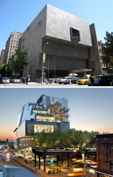
The Whitney old (above) and new.
Even before the new Whitney Museum opened to the public on May 1, 2015, critics were hailing it as a triumph. After five decades, the museum had left its bunker-like building on New York’s tony Upper East Side for a sleek new glass-and-metal confection in the Meatpacking District. It was a dramatic shift, as if an early 20 th century society woman had shed her corset and shimmied into a shiny flapper dress.
Greeting that flapper is a neighborhood in transition. Revitalized in 2009 by the opening of the High Line , the Meatpacking District is now home to upscale boutiques and eateries (prices might actually be similar to those on the Upper East Side, though the hipness factor is higher). Needless to say, the few remaining meatpacking warehouses lining Little West 12 th Street look a wee bit forlorn, like bums crashing the party.
Then, too, there’s the fact that this neighborhood abuts Chelsea, home to our temples of art consumerism, the big commercial galleries. As Holland Cotter put it in an April 23 rd New York Times review , “Economically, Chelsea is a gated community: Artists can visit but must live elsewhere. What will the Whitney do with that? Whose friend will it be? Market or artist? It cannot be true friend to both.”
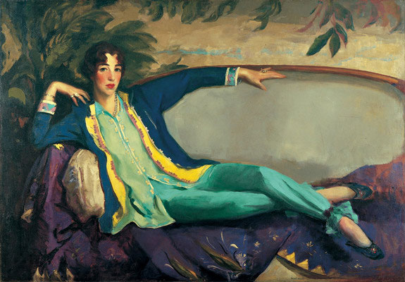
Portrait of Gertrude Vanderbilt Whitney, by Robert Henri, 1916
So there are layers of complexity here–and there’s charm, too, because the Whitney is returning close to the place where, in 1914, sculptor Gertrude Vanderbilt Whitney launched a modest enterprise called the Whitney Studio Club. Whitney, pictured above (rather scandalously for the time, wearing pants) was born into the Vanderbilt family and married into the equally affluent Whitneys, but expressed herself freely as a bohemian, sculptor and champion of women artists. Wealthy as she was, she probably couldn’t have imagined the new building’s half-billion dollar price tag or its status as the focal point of a neighborhood.
I was intrigued, then, when art photographer Peter Funch sent me photographs from an ad campaign he’d shot. Launched this spring to promote the Whitney’s opening, it highlighted the new museum’s neighborhood in a playful, creative way.
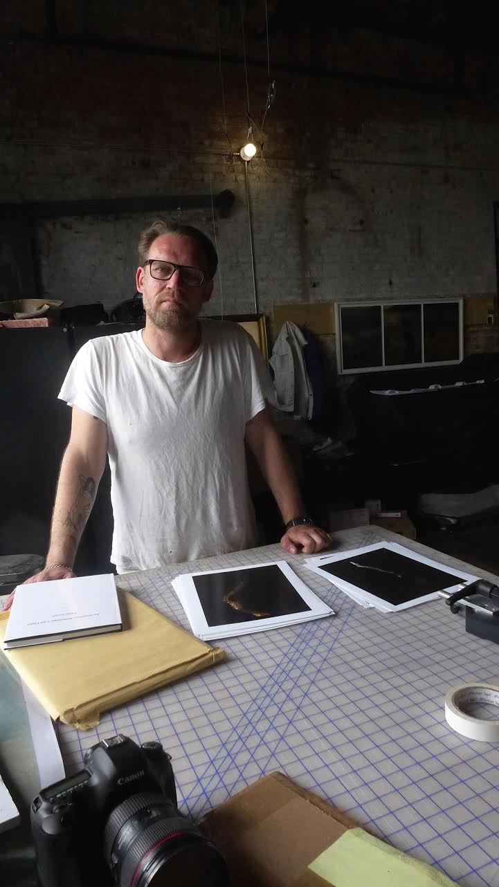
Funch in his studio. Image (c) Sarah Coleman
Earlier this year, I interviewed Funch for a story in Photo District News about collaborative photography projects. He had recently photographed Mount Baker in Washington State for Project Pressure , a charity that aims to highlight climate change by artfully documenting the world’s disappearing glaciers. Initially, Funch told me, he wasn’t excited about photographing a glacier: his work tends to be more complex and conceptual. But he found his way into the project through vintage postcards, which inspired him to shoot a single scene separately through red, green and blue filters, then sandwich the layers, playing up their variations. The results are compelling, recalling old postcards with color offset problems and highlighting the passage of time to which both man and mountain are susceptible.
Funch likes layers, and he likes playing with time in his images. In a previous project, Babel Tales , he composited images shot in the same place over weeks, choosing a theme for each combination—so that various people in a single image are smoking, or hauling something heavy, or carrying a manila envelope. For another project, Last Flight , he traveled to Amelia Earhart’s birthplace in Kansas and documented a bridge being dynamited, drawing a parallel between the bridge’s disappearance and Earhart’s last flight. “My work is about humans interacting with the landscape, and elements of connectivity across time,” he told me, adding that he’s inspired by movies whose storylines overlap and converge, like Robert Altman’s Short Cuts and Paul Haggis’s Crash .
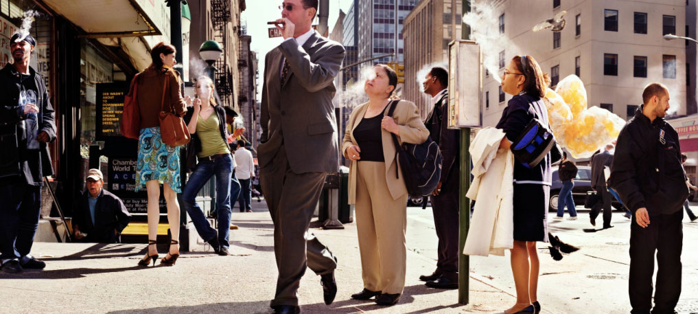
Smoking Smokers, from the Babel Tales series. Image (c) Peter Funch
Clearly, then, Funch was the perfect choice for the Whitney campaign. Ambitiously, the commissioning ad agency, Grey, had the idea of taking the museum’s works out onto the streets. As it happened, quite a few works in the Whitney’s collection were made by downtown New York artists, and some featured identifiable locations near the museum. Placed in the landscape, these iconic works blended into their surroundings, which served several goals: it brought the past’s artistic legacy alive, paid homage to the new neighborhood’s vitality, and underscored the ad’s tagline that “American art is now at home in the Meatpacking” (in fact, the ads implied, it has always been at home there).
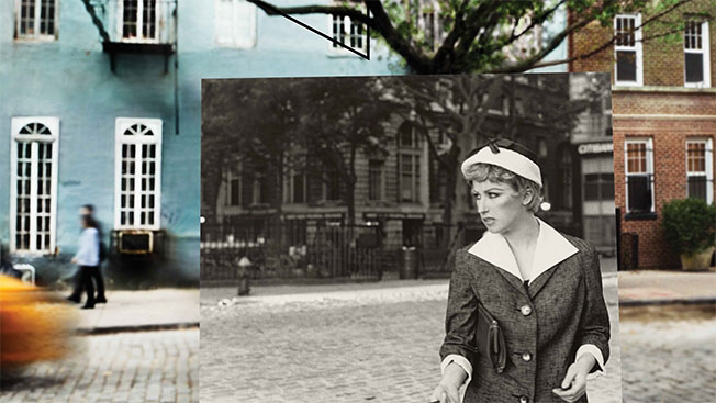
An iconic Cindy Sherman film still photographed on Jane Street. Image (c) Peter Funch.
“I’ve worked a lot with relationships between past and present—which this campaign communicates in a playful way,” Funch told me. Figuring out locations and merges was great fun, he said: “Some are expected, others are more subtle.” For the black-and-white Cindy Sherman film still above, for example, “we looked for a street with the same kind of cobbles, and a house with a tree in front—then we worked in some contemporary elements, like the yellow taxi passing by.”
In recent years, it has become something of a photographic trope to take a historic photograph back to the location where it was shot and overlay it onto the contemporary scene: here are examples from London , from America , and from the more personal crowd-sourced site Dear Photograph . Funch says that these projects were “a nice reference for this campaign, because we wanted to make it accessible in the same way.”
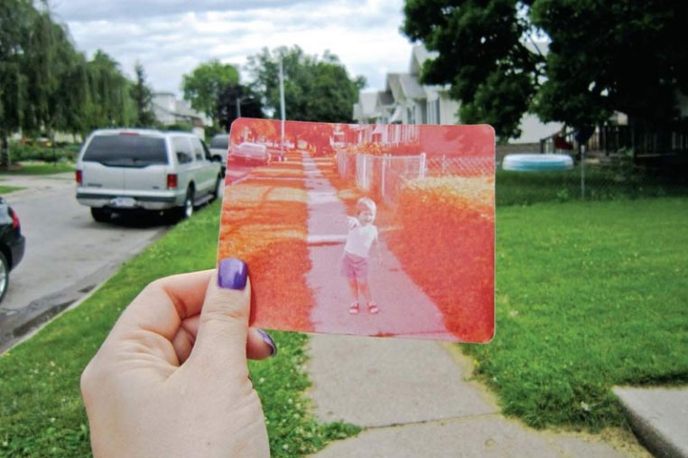
An image from the crowd-sourced Dear Photograph project, a reference point for Funch
Of course, one wants to know the behind-the-scenes story of how these images were made—especially what kind of liabilities and conservation issues were involved. Finding out that reproductions were used (“because of humidity and other concerns,” Funch says) might take away some magic—still, there’s something pleasantly meta about famous paintings and photographs having to be reproduced photographically in order to be photographed. If someone had painted Funch making the images, the circle would be complete.
In any case, Funch’s images whet my appetite to see the new Whitney Museum. So yesterday, on a wet, cold Monday that felt more like November than the first day of June, I trekked downtown to explore the city’s new home for American art. Rain aside, I wasn’t disappointed.
The Whitney’s outdoor platforms (left) overlook the High Line (right). Image (c) Sarah Coleman
In his April 19 th architecture review in the New York Times , Michael Kimmelman perfectly described the idiosyncrasies of the Renzo Piano building, which looks like “a factory or maybe a hospital” from the north, and from the west, is “a little odd, vaguely nautical, bulging where the shoreline jogs, a ship on blocks perhaps.” It is, he writes, not a masterpiece but “a deft, serious achievement, a signal contribution to downtown and the city’s changing cultural landscape.” Most significantly, unlike the fortress-like structures of the old Whitney and the Guggenheim, which “reflected ambivalence about what was outside the front door,” the new Whitney is open, airy, and “lets the city pour in.”
As Kimmelman points out, it takes time for grand new buildings to settle into their environments. But if we can’t yet definitively judge the museum building, the inaugural show is—in my view (and I’m not alone )—a home run. With energy and brio, it presents a century of American art through thematic “chapters,” tracing the evolution from European-influenced avant gardism to a more homegrown product. When there are clashing perspectives (as implied by the show’s title, America is Hard to See ), it just makes for more interest and fun.
The Whitney’s inaugural show emphasizes all media. Image (c) Sarah Coleman
Most refreshing of all is the playfulness of many rooms—and particularly, the mixing of media. For once, photography is not segregated but welcomed to the party, and it makes a lovely guest. Ironically, my last post here concluded with British photography dealer and collector James Hyman wishing that people would “look at the whole world of art more holistically” and include photography, because “if you’re collecting 1920s and 30s French Modernis[t painting]…why would you not have [photographs by] Man Ray or Brassai as well?” Indeed. And as the Whitney’s show proves, it’s not just about inclusion, but about cross-pollination: the photographs play off the paintings, and vice versa, in ways that elucidate both.
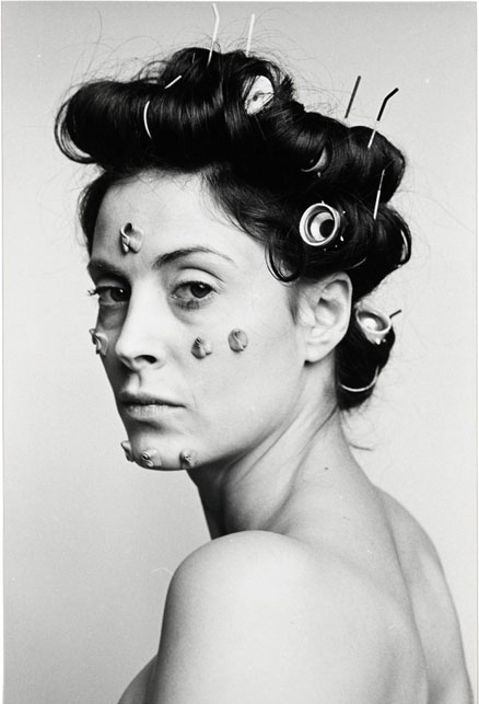
S.O.S. Starification Object Series (Curlers) is one of many strong images in “Learn Where the Meat Comes From.” Image (c) Hannah Wilke, 1974
Take, for example, chapters such as “Fighting with All Our Might,” “Love Letter from the War Front” and “Learn Where the Meat Comes From,” all of which look at moments in American art when it was inextricably intertwined with politics. In “Fighting,” that moment is the 1930s, when photographs by Dorothea Lange and Walker Evans merged art and reportage to form an indelible image of economic hardship. In “Learn Where the Meat Comes From,” the moment is Second Wave Feminism in the 1970s, when women artists like Cindy Sherman and Hannah Wilke used photography to examine issues of sexual politics and identity. Finally, photography is even more prominent in “Love Letter,” which deals with the impact of AIDS on the artistic community in the 1980s, and the coming-of-age of combative photographers like Robert Mapplethorpe, Peter Hujar (who is also pictured here, in a touching triptych taken on his deathbed by David Wojnarowicz) and Nan Goldin.
I could go on for a long time about this, but I’d rather you go there and see it for yourself. All I’ll say is that, in addition to still photography, there are two multimedia rooms in the show that photography fans shouldn’t miss. One is “Free Radicals,” which includes a lovely short film by beloved street photographer Helen Levitt, and a Surrealist-influenced film by early feminist artist Maya Deren. The other is Nan Goldin’s The Ballad of Sexual Dependency , which screens as part of “Love Letter from the War Front” (and one of whose images was used in Funch’s ad campaign). Years ago, when I first saw “Ballad” as a slideshow with background music, it cemented the power of the work for me—and since the opportunity to see it in this form doesn’t happen often, it should be seized.
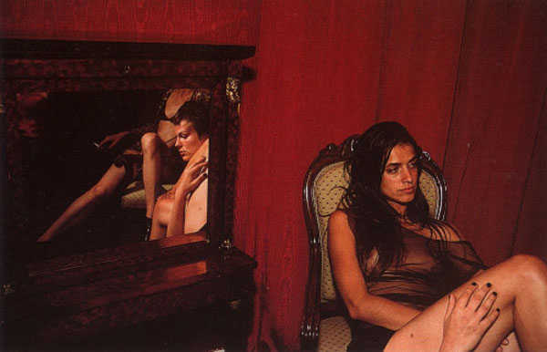
From The Ballad of Sexual Dependency. Image (c) Nan Goldin, 1985
The inaugural show, America is Hard to See , is up through September 27. I’d recommend budgeting at least two hours to see it, along with some time to enjoy the museum’s generous outdoor spaces (especially if it’s a nice day). There’s also an attractive restaurant on the ground floor and a café upstairs, not to mention all the wonderful eating opportunities in the neighborhood (Chelsea Market is only a few blocks away). And of course, while you’re down there don’t forget to walk around and appreciate the layering of past and present, the echoes of history, and the distinctive blends that make up this unique environment.
———————————————————————
Plan your visit to the Whitney Museum of American Art here .
Visit Peter Funch’s website here .
3 comments on “ Time Blending: Peter Funch and the Whitney Museum ”
Leave a Reply
Connecting to %s


Reblogged this on debsartdesigns .
Thanks!
Reblogged this on sam tumblin favorite artists and more .