Well-Worn Words: An Interview with Robin Cracknell
This is the second of two posts from London.
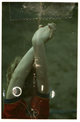
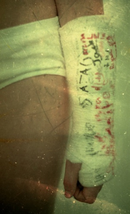
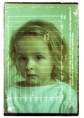
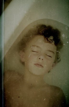
In an increasingly digital world, photographer Robin Cracknell is an anomaly. An artist who uses film exclusively, he even goes out of his way to find expired, damaged film, delighting in its faded tones and scratches. Once the film is exposed, he combines it with text, salvaged cine film frames and other found elements to produce poignant works that hint at memory’s fragmentation and the bittersweet passage of time.
I first came upon Cracknell’s work in the 2014 book Photographers’ Sketchbooks , and connected with it immediately. Having studied both visual art and literature, I have an affinity for work that combines text with images, and was also moved by the warm tones and worn surfaces of Cracknell’s work. Like a teddy bear with rubbed-off fur, these images speak of charged emotional bonds, but manage to avoid sentimentality. They are beautiful but challenging, familiar and yet elusive.
Born to British parents who lived abroad–first in India, then in the States—Cracknell grew up versed in different cultures. An English Literature major, he briefly considered writing before getting his first job in fashion photography—a milieu whose splashy drama hardly suited his introverted nature. A move to London, and an entree into the world of book cover design, was a better fit, enabling him to combine his creative skills with his love of literature.
But it is really through his personal work—much featuring his son, Jake, who he brought up as a single father—that Cracknell expresses himself, exposing his doubts and grief, illuminating parental frustrations and the challenges of romantic relationships. Clearly, these are rich veins to mine, and he approaches them boldly. Though his work focuses on memory, he is not precious about his own past: a few years ago he disposed of thirty years’ worth of negatives, saving just one hundred before moving on to new endeavors.
In his home and studio in London’s Barnes, we discussed randomness, difficult childhoods, artistic growth and the power of words.
I read that you were born in Calcutta; you left when you were six. Do you have memories of those early years?
I do, but not great ones. My mother worked with Mother Theresa, and I think that because she was consumed with her work with lepers and the dying, she had a way of making my sister and me feel guilty about how good and safe our lives were. She’d tell us about how a child had died in her arms, or that she’d held a child our age that weighed a third of our weight. She wanted us not to take what we had for granted—but since then, I’ve learned that it probably made both my sister and myself feel bad because it wasn’t our fault that we were white and well-fed. So she meant well, but it was a strange childhood. Our life was horse-riding, cricket and birthday parties with clowns, but there was a world of pain beyond the fence.
That’s intense. But you moved to Washington D.C., and went to Georgetown University to study English Literature?
Yes, I started as a business student but couldn’t stand it and switched after a semester. I’d chosen business to please my parents, but realized I didn’t know anything about math or accounting or statistics, then switched to Literature and saw I was a lot better at that. My parents eventually came around.
Who were some of your favorite authors?
Mostly modern writers, people like Salinger and poets, like Plath and Sexton. Poetry appealed to me, though I didn’t think I was good enough to become a writer. I thought about going into journalism, but I had a bad stutter, and the idea of interviewing people was daunting. My first job out of college was assisting the fashion photographer Ruven Afanador, and through him, I got in to fashion photography and went to Milan. But again, fashion photography was a mismatch—it’s so much about hanging out at clubs, networking, and being cool, which isn’t me. I was lucky, when I came to London, that I started getting work designing book covers.
That seems like a perfect match, given your background as a Lit student.
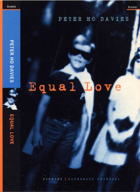
Yes indeed. And designing book covers in Great Britain in the mid-late 1980s was fantastic. Publishers took so many risks, and there were no briefs—they’d send you uncorrected proofs and give you two weeks to do what you wanted, whether it was a collage or scratchy print or pencil marks on a blank page. They trusted you, and that, for me, was amazing. I did it for ten years and learned so much. To be able to pore through a thick text and think, What is the essence of these words, and how can I distill that into imagery? It was exciting.
How did you go from narrative to visual concept?
A lot of them just shout out at you. I’m sure you’ve read books and have thought, This particular scene or character is the truth of this story. I wasn’t a parent yet, but I got lots of books about childhood, which allowed me to work with my own stock and also seek out kids for shoots. Most novels about childhood explore the darker side, which worked well for me because it resonated with my experience.
In your artwork, you often superimpose a word or a phrase onto an image, and there’s something very emotive about it, even if it’s not really clear what the relationship between the two is. How did you arrive at that combination?
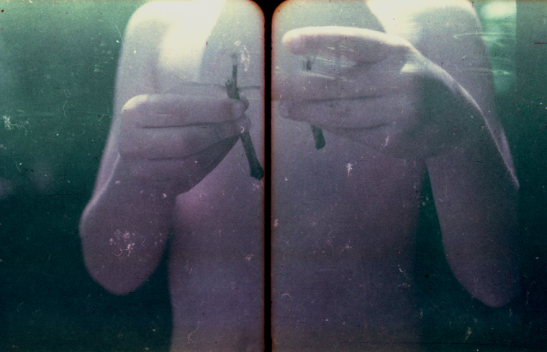
After Milan, I came to London and I was broke, and used to hang out at the Institute for Contemporary Art, which screened art-house movies. It was a great place to be in those days, because for £3 you could watch the most amazing double features, strange pairings like Robert Frank’s Cocksucker Blues with some kind of obscure Chinese film. I was there so much that I made friends with the projectionist, and I’d hang out with him and see these cut-up lengths of vintage 35mm film on the floor. They were fantastically aged, not in a Photoshop-fake way, but by traveling through projectors and being exposed to heat and mistreatment.
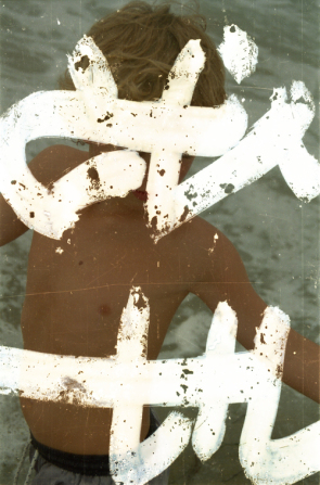
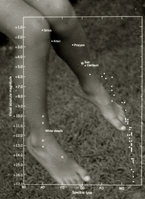
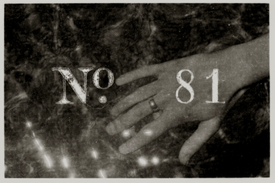
I started collecting those bits and pieces, then realized that because they were the same size as my own film, I could sandwich frames together. Usually it’s just a random word on the film stock that just happens to fit with my photograph. A lot are in foreign languages. I have an image called Murderer that shows my son Jake at the beach with a Chinese character superimposed on top of him. I chose that Chinese character because the shape fit where his arms and face were—then a year or two later, I found out that it meant murderer, and loved the contrast of the horrible word and innocent child image. So it’s about random connections—but also, as a person who has stuttered his whole life, I have a true affection for words, and a lot of experience with saying the same half of a word again and again and again, feeling stuck in that loop. So a lot of my works feature parts of words, or words that have been crossed out, just to give the idea that language is hard, you know. It’s hard. Even when you don’t stutter, it can be difficult to say what you feel.
How did using Jake as your model affect your relationship with him?
It was never easy. We didn’t have photo sessions; instead, I had to sneak shots here and there. If you look at my contact sheets, you’ll see they’re just moments, because his patience was short. It wasn’t that he was embarrassed or angry, he just didn’t understand why I was taking photographs. So it was never exactly collaborative, though he pretty much understood that if I had a camera around my neck, there would be a time that day when he’d have to put up with me taking a few photos. But I made sure that I kept it short and sweet.
When people use their own children as models in photographic work, there can be criticism that they’re exploiting and/or sexualizing them. Sally Mann is obviously the prime example. Did you get any of that?
Not too much. But when I had my first show in 2007, afterward I went to a preview of the next show there and I was having some drinks with two women who, without knowing who I was, started telling me how awful the show they’d just seen was, by some guy who’d exploited his child. They said, We know this because we’re social workers, and we can tell you this guy went out of his way to take tearful, grief-y, staged pictures of his poor son. And after a while I said, Well, you know, that was my work, and actually I’m a single parent who fought long and hard in the courts for a year, and gave up my job, to make sure I stayed with my son. I don’t need to be lectured about my skills or love for my son. As for the artwork, it’s about my connection to childhood, which I’d be trivializing if I just showed it as joyful. I’m trying to show how much I feel for Jake—because when my wife left him, she left me too. I’m trying to say that this child’s grief matters, and there are probably a lot of children like him, who feel the heartache he feels.
How did they react?
I don’t think they bought it. But I was pleased that they heard me out. And I appreciated what they said, too. I wasn’t trying to do a gotcha; I like to hear feedback. It would be boring if all I heard was, Your stuff’s great.
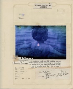
I first came across your work in the book Photographers’ Sketchbooks , which featured some of your beautiful notebook pages . Again, the combination of words and imagery is intriguing. You even use Braille…
I love the tactile quality you get with Braille, and the idea of mixing it with photographs, because it plays with the idea of seeing. Also, it reminds me of how, at the end of a film reel, you get those dots, so it gives you that nostalgic feeling about the end of something.
Speaking of ending, a couple of years ago you destroyed thirty years’ worth of negatives, saving just a hundred and turning them into a project called I Saved 100 . What made you decide to get rid of those negatives?
That’s an interesting wordplay, because I was getting rid of negatives in the sense that I felt it created negative energy to have stacks of negs from past jobs, past lives, past girlfriends. I’d found myself getting lazy, going back through them and thinking, This is a shot I took ten years ago, it’s sort of nice, maybe if I just scratch it up a bit I could make it relevant and new again. I thought, the only way I’m going to get myself off my ass and out there doing something new is if I get rid of the safety net. So I went to the loft, got my old ring-bound files, and started chucking out pages. In saving some, the only rule I imposed was that they had to be landscape format, and that I didn’t want any repetitions of subject matter. Otherwise, the picks were random.
Randomness seems to be a thing for you. You also have a site where you create poetry from shuffled-up quotes from foreign language movies. What’s that about?
My son taught me to extract subtitle files from foreign films and shuffle them—a Dada sort of thing, like Jean Arp cutting up text and letting it fall on the ground. I’ve done about eighty: a lot of Chinese and Japanese films, Tarkovsky, Bergman, stuff I like. Curiously, the first one I did was Finding Nemo , which was the film Jake chose to show me how the process worked. That’s about a father trying to find his son, and it’s poignant—and this was around March, when Jake left home to live on his own. So it was very appropriate that the dialogue was about a father mourning his son, hoping he would be safe in this mean, danger-ridden world.
Maybe not so random, then?
No. It’s exciting how these shuffled combinations of text end up in almost perfect poems, which often end up having nothing to do with the film. Even as I’m talking about it, I’m getting chills. It gives me a huge appreciation for language, and the power of words.
What’s next?
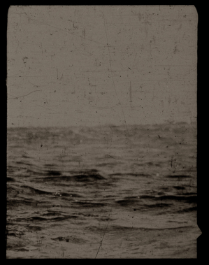
My newest project is called Weight, the sea , and it’s about the end of a relationship. I happened upon a book called The Beginners’ Guide to the Sea , and the chapters seemed to resemble the seven stages of grief for the end of a relationship—things like How to Recognize Signals, How to Navigate Stormy Water, How to Salvage a Wrecked Ship. And I think there’s a shared culture of the sea, with all the poetry and songs about it. How do you photograph missing someone? That was the question, and I think the sea symbolizes longing and grief and absence. I hope it makes sense, in a not-too-arty way. I want to make images that people can tap into on an emotional level. Using text, scratching an image, obscuring it: in the end, it’s all part of the same goal.
Visit Robin Cracknell’s website here .
One comment on “ Well-Worn Words: An Interview with Robin Cracknell ”
Leave a Reply
Connecting to %s


I didn’t know this novelist