Invisible City: An Interview with Marc Yankus
 Whether they’re Art Deco skyscrapers or contemporary apartment blocks, the distinctive buildings of New York are well known. We’ve all seen them photographed
ad infinitum
, from the snail-like whorls of the Guggenheim Museum to the reflective planes of our latest skyline addition, the Freedom Tower. Photographically speaking, it’s hard to imagine a completely new take on New York City as a built environment. But that’s what
Marc Yankus
has managed to give us with
The Space Between
, on show at Chelsea’s
ClampArt Gallery
through May 17.
Whether they’re Art Deco skyscrapers or contemporary apartment blocks, the distinctive buildings of New York are well known. We’ve all seen them photographed
ad infinitum
, from the snail-like whorls of the Guggenheim Museum to the reflective planes of our latest skyline addition, the Freedom Tower. Photographically speaking, it’s hard to imagine a completely new take on New York City as a built environment. But that’s what
Marc Yankus
has managed to give us with
The Space Between
, on show at Chelsea’s
ClampArt Gallery
through May 17.
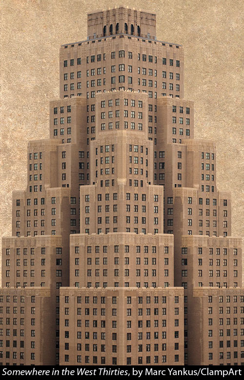
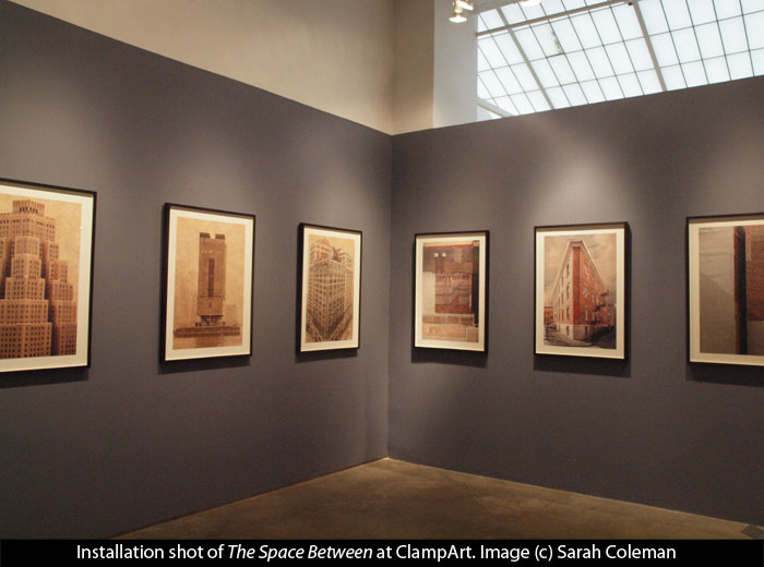
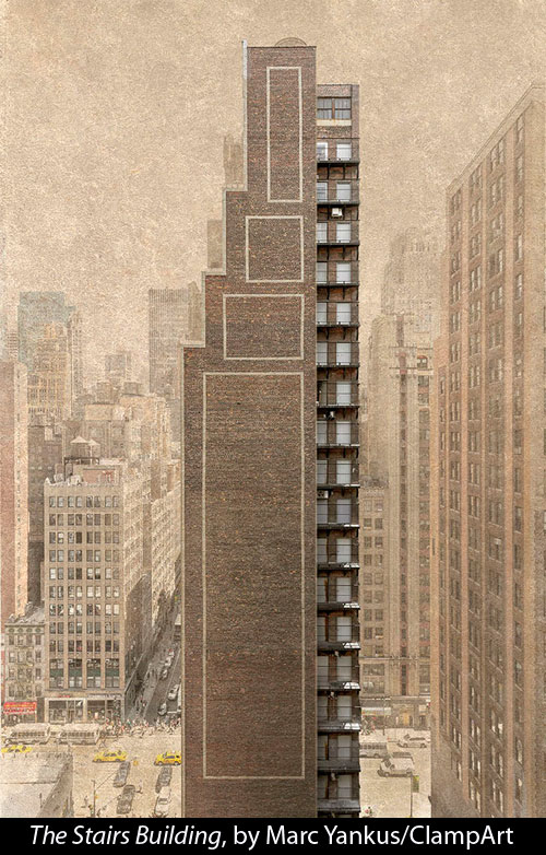
The Space Between mixes realism and fantasy, contemporary and historical, the grand and the mundane. While the buildings Yankus depicts are all real ones in New York, he has manipulated the images, fading out surrounding buildings and adding a textured sky that gives the image a feeling of an old sepia print or an architectural rendering. At times, when a building was incompletely visible in his initial photograph, he has removed surrounding buildings and recreated its hidden parts. The result is an intriguing combination of known and unknown elements, like something you might encounter in a dream.
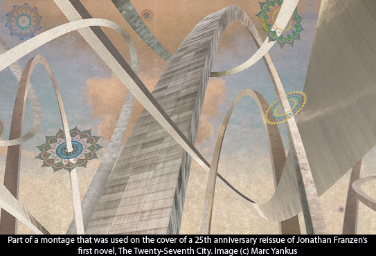
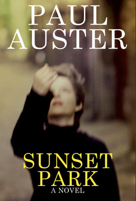
 For Yankus, this represents a major departure from work that has characterized his career to date. He is known for romantic, soft-focus images whose surface seduces the eye while hinting at hidden depths beneath. Perhaps because of that subtextural quality, his images have graced the covers of many prestigious literary novels, from Paul Auster’s
Sunset Park
to Salman Rushdie’s
Shalimar
to Jonathan Franzen’s
The Twenty-Seventh City
.
For Yankus, this represents a major departure from work that has characterized his career to date. He is known for romantic, soft-focus images whose surface seduces the eye while hinting at hidden depths beneath. Perhaps because of that subtextural quality, his images have graced the covers of many prestigious literary novels, from Paul Auster’s
Sunset Park
to Salman Rushdie’s
Shalimar
to Jonathan Franzen’s
The Twenty-Seventh City
.
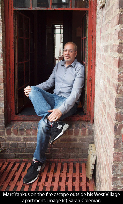
Earlier this week, Yankus graciously invited me to his West Village apartment (where many of his images and book covers are on display) to discuss his current and past work.
How did your project The Space Between begin?
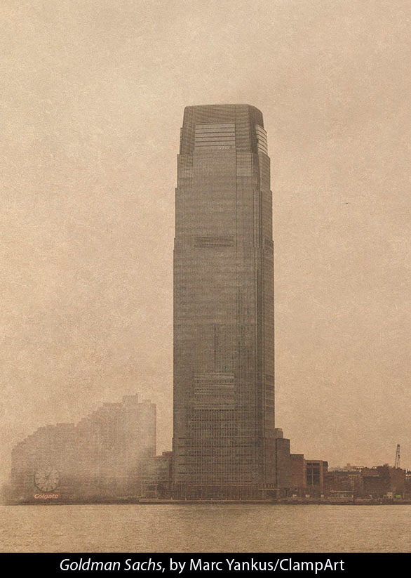
In early 2013, I was photographing the Goldman Sachs building in New Jersey from across the Hudson River. It’s elegant, but I thought the buildings around it were ugly. All of a sudden, I realized I didn’t have to be literal; I could break the rules I’d set for myself in photography.
 Which were…?
Well, in photojournalism there’s a rule that you don’t manipulate a photograph, it’s not ethical to do that. Although I’m not a photojournalist, I’d always followed that rule. I wouldn’t manipulate the structure of a photograph, I’d never change a building. Once I freed myself from that stricture, the project took off.
Why The Space Between ?
A lot of buildings in New York are built tight up against each other, but in some cases there’s a space between them–not much, maybe six or eight feet. I find that space intriguing. Why was it created, where does it go? What happens there? Even outside my window here in the Village, you can see a space between two buildings. Interestingly, when this project went public I heard from one of my old professors at the School of Visual Arts, who told me she’d once given us that title for an assignment. I didn’t remember that, but maybe I used it subconsciously.
It could also be taken more generally, as the space buildings need between them to breathe, or the space between people living in close proximity in an urban environment.
Indeed.
 Part of what makes this work so compelling for me is the mix of realism and fantasy. The skies, especially, give it an otherworldly feel because of the texture you layered onto them. How did you achieve that, and why did you choose that look?
I wanted to bring the focus to the buildings, and using that texture in the sky seemed to isolate the subject. It’s the same texture throughout the series: it comes from a document I purchased in Prague a long time ago, some kind of book of identity papers. It’s the texture on the cover of the book; I scanned it a long time ago and thankfully saved it.
How did you first get into photography?
I went to the High School of Art and Design in midtown Manhattan, and my major was photography, for no special reason: I also loved drawing and did that throughout high school and college. In college, I saw a show of Joseph Cornell’s work that inspired me, and after that I started making collages with engravings cut out of old books. After a while, I incorporated found photographs, then my own photographs. In 1979, I started doing collages for clients like the New York Times and Tiffanys, and I was doing that throughout the 1980s and 90s, as well as showing personal work at the Key Gallery in SoHo. I had a studio in SoHo right near Hannah Wilke, a feminist artist who was known for making vaginas in a variety of media.
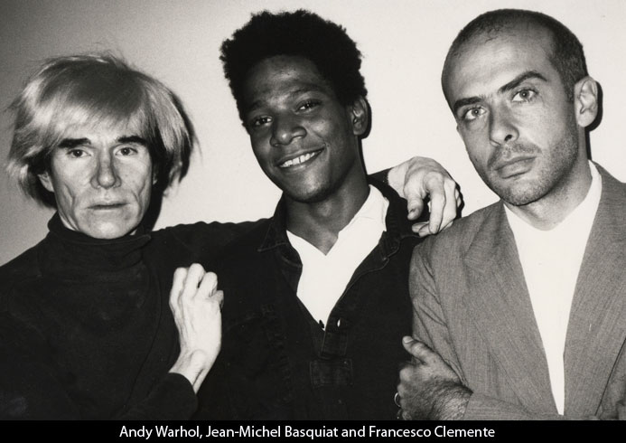
That must have been a heady time. There was so much going on in the New York art scene in the 1980s, from the feminist art movement to Warhol’s Factory and people like Jean-Michel Basquiat and Keith Haring coming up. Were you in that environment at all?
I was. It was incredibly exciting. I was in school with Keith Haring and Kenny Scharf. I lived right near the Paula Cooper Gallery in SoHo, where Francesco Clemente and Eric Fischl showed; I’d go to openings there. It was incredibly exciting. I met Warhol several times, and met Jean-Michel; I went to Studio 54 and sat on a couch next to Liza Minnelli. Recently, when I was in India, I happened to meet Francesco Clemente on a plane going to Varanasi; he was sitting in front of me me. That was a thrill, because I love his work.
How did you get into doing book covers?
In the late 1990s, I started noticing how beautiful book covers were, and I made a little display box of photographs that I sent around to art directors at publishing houses. That was an immediate success, and I started getting commissions.
 Do you typically read the whole book when you’re commissioned for a cover, or are you asked to realize a concept?
It happens in various ways. Sometimes the art director has a fully-developed concept and I don’t read the book. Other times I have full freedom, then I read the book to develop my own ideas. Then there’s a middle ground where the art director has some ideas, but I’ll read at least some of the book to develop an approach.
Do you try not to be too literal when you’re doing the cover?
Exactly; you don’t want to give away the story on the cover. It’s more about a mood. Book covers tend not to show faces; they’re more elliptical.
I’d imagine it makes a difference if you love the book or hate it.
Of course, it helps if you love the book. Most of the novels I’ve done the covers for are pretty good. Occasionally there’s something very tedious, but I still manage to create a good cover. I can still get interested in the work of art I’m creating, even if I’m not interested in the book.
 Were you a big reader before you started doing covers?
Yes, I used to love to read as a kid. Actually, I read more than I socialized; books were my friends. When I was an adolescent, my mom and stepfather had a restaurant, and I used to deliver food orders to a book distributor. Instead of giving me a tip, they’d let me go in the back and choose some books. That was amazing–it was like candy!
I can relate to that. So what’s next for you?
I’m going to continue T he Space Between ; I don’t feel it’s anywhere near done. When I was in India two months ago, I took hundreds of photographs of buildings. I’d be interested to go to Detroit and photograph buildings there, before the city is revitalized. Or even the industrial areas of Long Island City. It’s a question of finding the right places.
—————————————————————————
The Space Between is on view at ClampArt Gallery through May 17, 2014. For directions and hours, click here .
8 comments on “ Invisible City: An Interview with Marc Yankus ”
Leave a Reply
Connecting to %s


I love the idea of isolating these buildings in manipulated photos. Although as an urbanist I prefer them in real space and time to be all crowded together, making up vibrant streets and districts.
Photography, writing and the spaces between!
Michael, thanks for making that connection! It had actually escaped me…
I really enjoyed reading about Marc’s art and the process that he went through to arrive at his images. The images of the buildings are haunting while being matter of fact too. What a varyied and exciting career.
Another great post. You must be quite a name to conjure with in the world of photography, as so many artists are happy to be interviewed. It’s clear you always ask the right questions. Nice to have two of your own photos included. Vera Coleman vrcoleman@btinternet.com
Another wonderful, literate story and interview from the Terry Gross of photography journalism!
Thank you, Stephen! I love Terry Gross, so there could be no better compliment (and usually I only get comments like that from my mom! see above). I have some juicy interviews and other good stories coming up in the next couple of months, so please stay tuned!
I swear I do not know your mom. And the large sum wired anonymously into my account can never be traced to her.